


Site optimization under the mobile devices
Site optimization under the mobile devices
Now not everyone has the opportunity to stay at a computer or laptop constantly, but the phone - is always with you. Statistics show that the frequency of mobile Internet usage has increased significantly. That is why optimizing the site for mobile devices is a very important and integral part.
If we talk about the cost of adapting the site, then there is no standard amount, everything depends individually on the website.
Let's consider, first of all, what are the benefits of mobile optimization:
- convenient content viewing;
- convenient menu;
- quick loading of pages;
- there is often a possibility to switch from mobile to the main version;
- light weight:
- decrease the percentage of failures.
Basic rules:
- ease of navigation - any page should be readily available in a few steps, without complex filters;
- the search box must be placed at the top of the page so that the user can conveniently use it without spending time searching for it;
- the presence of filtering goods if their quantity is significant;
- image optimization, proportionally reducing them;
- increasing the size of the fields of information input;
- processing the content of the pages of the site;
- area of view, the size of the fonts should be changed to the size of the screen;
- the width of the content should match the size of the screen.
If you still have doubts about the need and effectiveness of site optimization for mobile devices, then you can go and view the sites of your competitors or use them adaptive design. There are special resources available, including Google Search Console. It's enough to copy the URL on the necessary site and paste it into the field of analysis. It takes a few seconds to wait, after which you will know if the site is optimized for mobile devices.
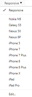
Another way to check - without the use of services. In Google Chrome, you simply need to go to the site, click on the free area PKM (or F12) and select "Check". You will see:
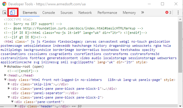
Then, click on the highlighted icon and a list of popular mobile devices emulation that you can choose from as an iPad and specify your own extension.
You need to know the basic rules of PHP and the base of the main devices to enter the appropriate template for smartphones and mobile phones. A script written must determine the type of device and, accordingly, display a specific template for it. But you need to know that not all CMSs have such plugins, and they will not always work efficiently.
Regarding the site's address - it will remain the same as the main site, only templates will have significant differences.
If the site is voluminous, with a large volume of goods, then a subdomain with the same "engine" with the same database on both sites is created. When a user enters the site from a mobile device, it is automatically redirected to the subdomain.
Since the share of mobile users is steadily increasing, it is worth thinking about adapting your site. After all, for each owner, the loss of potential customers is not appropriate. Optimization to a large extent will ensure the effective growth of your business.
Our Recommendations
- Effective design of an online store product card (SM)March 31, 2023olga.hrytsayuk903
The main task of every online store is to turn potential customers into buyers. An attractive and user-friendly design, high-quality front end and back end contribute to this. One of the key factors is the competent design of the product card.
- The importance of using software in the modern business world (SM)March 09, 2023olga.hrytsayuk744
The software development market is a leading one in Ukraine. Our IT specialists are in high demand not only in the national but also in the global economy. This is evidenced by the statistical data of recent years.
